Managing documents becomes inefficient when all folders look the same. Even with previews or thumbnails, it is often difficult to understand what a folder contains or how important it is.
A better approach is to organize document work visually. By using folder colors, icons, and labels, you can recognize folders instantly without opening them.
Assign priorities to folders
Not all documents are equally important. Some require immediate attention, while others are archived or completed.
- Red - urgent documents
- Green - completed work
- Yellow - in progress
- Gray - archive
With visual markers, you can instantly understand which folders require action and which do not.

Organize documents by type
Another effective strategy is to organize folders by content type instead of only using names.
- Different icons for reports, contracts, and presentations
- Colors for departments or categories
- Custom covers for projects or clients
This allows you to recognize what is inside a folder instantly, even in large directories.
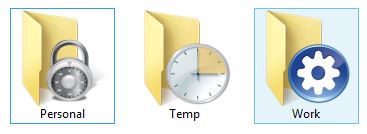
Make folders more informative
Instead of being just containers, folders can become visual indicators of their content.
By combining icons, colors, stickers, or cover images, you can make folders show what they represent.
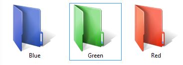
This reduces the need to open folders repeatedly and speeds up navigation significantly.
Why default Windows folders are not enough
Windows allows basic folder icon changes, but the process is manual and limited. It also does not support folder colors directly.
This makes it difficult to build a consistent and scalable organization system using only built-in tools.
Default Windows vs FolderIco
| Feature | Windows default | FolderIco Best |
|---|---|---|
| Visual folder organization | Very limited | Easy |
| Change folder colors | Not supported | Built-in |
| Custom icons and covers | Manual | Fast |
| Reusable folder styles | Not practical | Favorites system |
| Search for icons and graphics | Not available | Built-in search |
A visual folder system can significantly improve productivity, especially when working with many documents or projects.
Frequently asked questions
Use the smallest palette that covers your recurring categories, often four to seven colors. Too many similar colors are difficult to remember and make the document system slower to scan.
Pick one dimension for color. A practical setup uses colors for status, such as active or approved, while folder names or icons identify document types such as reports, contracts, or images.
Agree on folder names, color meanings, and an archive rule, then save a short legend in the shared root folder. The visual labels should reinforce a convention that every team member can follow.
Do not communicate meaning through color alone. Combine colors with descriptive names and distinct symbols so the categories remain clear in search, list views, grayscale, and for users with color-vision differences.
Archive completed work on a regular schedule that matches your workflow, such as monthly or at the end of a project. Moving inactive folders out of the active workspace keeps visual status signals meaningful.